Publised on Jun 24, 2024

Melvyn Lee

Are you creating a logo?
It's like baking the perfect pie, more challenging than it looks.
Imagine a beacon lighthouse; your logo must cut through the fog of countless brands to beam its unique message to the right audience.
It's all about concocting a recipe that harmoniously blends simplicity, versatility, relevance, and memorability to capture and communicate your brand's essence.
Your logo tells a story.
Embracing Simplicity
Less really is more when distilling your brand's essence into a logo. Overcomplicated designs can cloud your message and confuse your audience.
As we peel back the layers of potential graphics and fonts, we find that a simple icon or clean typeface often carries the most powerful punch. This streamlined approach ensures that your logo remains clear and impactful across every medium and usage.
Simplicity in design fosters instant recognition – the holy grail of branding.
Avoiding Overcomplication
Simplicity in logo design is not just a trend—it's a timeless principle that elevates brand recognition.
A single, clear idea in a logo often outshines elaborate patterns or multiple symbols in memorability and impact.
Regarding logos, complexity can be a barrier to customer connection. An uncomplicated design facilitates instant recognition and quickly cements a company's visual presence.
A straightforward icon or typeface allows for versatility and enduring appeal. In this fast-paced digital world, a simple logo ensures consistency across various mediums and scales without losing its essence.
Focusing on Core Elements
In logo design, distilling a brand into its core elements is akin to storytelling in its purest form. It's about harnessing the brand's ethos into a single emblematic, easily digestible, instantly recognisable representation.
Less is often more when it comes to effective logo creation. A minimalistic approach can be compelling.
Consider the logo's scalability—will it still be legible on a small mobile screen? Simplicity aids clarity across all sizes and platforms, ensuring the brand's message is universally understood.
Incorporating too many ideas dilutes a logo's impact. Please stick to one or two elements that best encapsulate the brand's identity and convey its story succinctly and directly.
Relevance is just as critical as simplicity. Every curve, line, and colour in the design should have a purpose and add to the brand's narrative. This strategic approach fortifies the connection between the viewer and the company.
Lastly, the logo should echo the brand's values and aspirations. It acts as a silent ambassador, encompassing the company's spirit while creating a lasting impression on its audience.
Ensuring Versatility
A versatile logo transcends mediums, maintaining its impact in print and digital landscapes. A mark of adaptability, it thrives across various applications.
To achieve true versatility, evaluate the logo's performance in different contexts—will it hold its own on a billboard and a business card? Critically, a logo must be versatile to ensure consistency in branding across diverse formats and potential future platforms.
Remember, a logo that scales well ensures seamless brand recognition. Its design must be resilient and ready to represent the brand on any stage.
Scaling for Different Mediums
Your logo must shine in every context, from tiny mobile screens to massive billboards.
Mobile Apps: Small but visible at a glance
Website Headers: Crisp and identifiable
Social Media Avatars: Recognisable in a sea of thumbnails
Printed Materials: Clear and detailed at any size
Product Packaging: Adaptable to different shapes and textures
Corporate Swag: Flexible for various merchandise applications
Scalability ensures your logo maintains its essence at any size.
Perfect scaling is crucial to brand consistency across all consumer touchpoints.
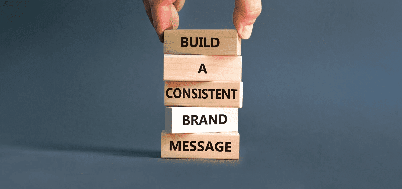
Consistency Across Platforms
Remember, your logo is a brand anchor, unifying your presence across various mediums and touchpoints.
Consistency across digital and physical platforms is the cornerstone of brand recognition. Your logo should be immediately identifiable, whether viewed on a smartphone screen, embroidered on company apparel, or plastered on a roadside billboard. This coherence fosters trust and reliability, painting a professional image of your brand.
The digital landscape is ever-changing, with new social media formats and devices. Despite these shifts, your logo must remain unwavering in its identity. Ensuring consistency means your logo adapts without losing its core characteristics—maintaining its colours, shapes, and overall design integrity.
Finally, consistency should be considered for rigidity. Yes, your logo must maintain its foundational elements across platforms, but it should also be flexible enough to evolve. A well-designed logo provides the scaffolding for future adaptations, maintaining brand recognition while embracing the dynamic nature of the digital world.
Selecting Impactful Colors
Colours speak volumes before a word is said, wielding power to evoke emotions and instantly convey your brand ethos. When selecting the palette for your logo, consider the psychological impact of each hue—red can signify energy and passion, and blue might evoke trust and dependability. At the same time, green often represents growth and vitality. The key is choosing colours that resonate with your brand's core values and appeal to your target audience, crafting a visual harmony that's pleasing to the eye and reinforces your brand narrative with every glance.
Psychology of Color
Colours are not just visually stimulating— they're emotional triggers, impacting perception and behaviour.
Red: Evokes energy, passion, and urgency.
Blue: Conveys trust, calmness, and stability.
Yellow: Associated with optimism, cheerfulness, and warmth.
Green: Symbolises growth, health, and tranquillity.
Purple: Implies luxury, creativity, and mystery.
Orange: Suggests playfulness, confidence, and friendliness.
Black Represents sophistication, power, and elegance.
White: Denotes purity, simplicity, and minimalism.
Choosing the right colour can be the pivot between an outstanding logo.
Your brand's personality shines through the colours you select, embedding your values in every pixel.
Brand Alignment
Aligning your logo with your brand's ethos ensures consistency across all marketing materials, creating a cohesive narrative that reinforces your positioning in the market. Every aspect of your logo should speak to the heart of your brand, solidifying a recognisable visual identity. A logo that strays from your brand values can confuse your audience, leading to a diluted market presence. Therefore, strong brand alignment is non-negotiable when creating a logo that truly represents what you stand for. It's like a visual handshake, making a promise about what your brand delivers regarding products, services, and values. Your logo is a commitment to your audience, reflected in the visual cues it sends.
Brand alignment means meshing logo design with your unique brand narrative. Only by interweaving your brand's story within the fabric of your logo can you create a lasting impression on your audience. It's building a bridge between design and strategy, ensuring your logo is a genuine brand ambassador. The design should mirror the company's objectives and ethos as the foundation for all brand communications. Ask every design decision if it aligns with the brand's core message. Only through such scrutiny can a logo transcend mere aesthetics to become emblematic of everything the brand stands for.
A logo misaligned with the brand essence is like a novel without a plot. It may attract attention but needs to tell a compelling story. Your goal? A logo that's an authentic representation of your brand's narrative, creating fruitful connections with your audience.
Typography That Speaks
Typography in logo design is not mere font selection; it's the voice of your brand-made visual. The suitable typeface carries weight, imbues character, and shapes perceptions, creating an unspoken dialogue with your audience. Consider typefaces as the silent ambassadors of your brand, each carrying unique traits that resonate at a deeper level of consciousness.
Font choice reverberates with subtext and nuance, tacitly conveying your brand's personality. Opting for a bold, modern sans-serif reflects clarity and innovation, while a classic serif may conjure tradition and trustworthiness. Each typographic decision subtly influences how your brand is perceived.
Font Personality
Font choice paints a picture of your brand's character, silently embodying its ethos, essence, and unique voice in the visual landscape.
It's the symbolic whisper that narrates your brand's values.
Like an actor's costume, fonts dress your message, setting the stage for how it's received, whether with formality (think traditional serifs) or casual modernity (cue the clean lines of sans-serif fonts).
This visual voice must harmonise with your brand's message, ensuring that every curve and line accentuates the right brand qualities.
When selecting a font, think of how it will echo through your branding, from business cards to billboards. Its form should maintain legibility, character, and, most critically, that immediate spark of recognition.
Ultimately, the power of font choice in your logo is to cement your brand's voice in memory, ensuring that your identity is both felt and remembered with each glance.
Readability Matters
Regarding logos, readability isn't just an option; it's essential for instant recognition.
Simplicity: Avoid overly complex designs that confuse the eye.
Contrast: Utilise colours that stand out against each other for clarity.
Font Size: Ensure text is large enough to be seen from a distance.
Whitespace: Use negative space to give each element room to breathe.
Scalability: Test your logo in various sizes to maintain legibility.
Your logo should communicate your brand's message clearly at a glance.
A well-read logo translates into a well-remembered brand, marking the difference between being glanced over or deeply ingrained in customer memory.
Conclusion
Crafting your company's logo is an intricate dance of aesthetics, vision, and strategy, each step orchestrated for ultimate brand resonance and acknowledgement. Its purpose is to strike a chord within the hearts of observers, merging visual allure with an unwavering brand promise.
Your final emblem will speak volumes. Let it echo your brand's essence.
Indeed, your logo's journey extends beyond the drawing board into the vast expanse of your customer's world, shaping perceptions and fostering loyalty. It's a visual handshake, an unspoken pact that beckons for community and connection.
Allow this symbol to serve as your silent ambassador, speaking volumes where words cannot, transcending barriers of language and culture with universal appeal. Let it not merely represent your business but become a harbinger of your collective vision, values, and future aspirations.
An effective logo is the lynchpin of a brand's identity, providing a point of convergence for stories, emotions, and experiences shared between you and your audience. It's a beacon that guides your customers home and back to you time and time again.
In conclusion, remember that every brand's tale is unique and waiting to be told. Weaving these narrative threads through your logo's fabric imprints your story in the public consciousness. Your logo isn't just an image; it's an enduring emblem of your enduring brand saga.